Thursday, February 25, 2021

Postcards and Winners

I had a need to make a bunch of something and there was a stack of postcards at hand, ready and willing to donate to the cause. There’s nothing like a growing pile of prints to make me feel productive. Using two small brayers (one-inch and three-quarters of an inch) I rolled out some backgrounds with leftover mixes of ink. 


A few hours later the ink was dry enough to overprint with a linocut of a coneflower I carved some years back. Again, I made use of some premixed ink – black with the addition of a few mystery colours.


Then I moved from postcards to notecards and practiced my mixing skills (titanium white with tiny dabs of phthalo blue and  phthalo green), aiming for a blue similar to these envelopes I had on hand. A dot of black would have likely greyed the ink down to a better match but I liked the slightly brighter colour and stopped there.

I printed a batch of backgrounds using the blue ink and that led to working on rolling up an even blended roll. This is where you lay out two or more colours of ink in a line that’s the length of your brayer. Then you load the brayer aiming for just the right mingling of the separate colours.


Mounting the coneflower linocut on stiff plastic (an old report cover) keeps the wiggly stem aligned and makes it easy to see where to position the image. The block is small enough to print with hand pressure but a portable Speedball printing press is easier on the hands and guarantees an even and consistent print.

The postcard idea and the coneflower block weren't anything new but the familiar format and image let me focus on other things. I played around with placement of the rolled-on ink.


Vertical or horizontal background? Small or bigger?

A single colour or two? 


A border or bleed off the page?

Add my signature dot? Or not? (I went with the dot -- I like how it stops the eye and brings it back to the central image.)

After a few days I'd amassed a pile of postcards and notecards, had a good go at practicing skills like the blended roll and improving composition, and ended the week on a pleasant note of satisfaction and productivity.

Plus I got to draw names for the give-away announced in the previous post! 

These blank concertinas are winging their way to Eileen, Suzan and Nancy. Enjoy!

Thursday, February 11, 2021

Gratitude and a Give-away!

As we approach Valentine’s Day it’s time to acknowledge (with much appreciation and gratitude) the Silent Partner in my art. A sweet and resourceful (not to mention long-suffering and patient) husband is responsible for fitting out the studio that occupies the back half of the lower level of our house and threatens, at any moment, to take over the entire downstairs.

My husband has built masses of shelving and storage space and work benches. He’s the muscle that unloaded, lugged in and assembled my 250-pound press. During our daily walks, he’s the fellow who lets me stuff his jacket pockets with junk I find on the road to take home just to see “how it prints”. He helps with setting up the occasional art show I host for family and friends (always with his homemade biscotti) and designs and constructs the display boxes, racks and easels that show off my prints so handsomely.

I’m also grateful to the art community, both in-person and on-line, that inspires, instructs and encourages so generously. And I owe a special thank you to the dear friend without whose technical prowess this blog would not exist. She remains anonymous, but I call her my Tech Angel! 

And that brings me to the reason for today’s short post – to thank all of you who follow my printmaking adventures. Especially during this time of social isolation it’s wonderful to have such a supportive connection. In appreciation, I’m giving away three of my handmade concertinas, pictured below. They make great little sketchbooks, travel diaries, photo booklets or even gratitude journals for jotting down all the good things in daily life. 

For a chance to win one of these blank, accordion folded books, send an email to the address in the Contact section at the top of this blog, and put Contest in the subject line. On February 25, 2021 I’ll randomly draw three emails and then be in contact with the winners. 

(Note: Contest now closed. Congratulations to Eileen, Suzan and Nancy.)

Again, thanks so much! And Happy Valentine’s! 

Thursday, February 4, 2021

The Heritage Series: Number 3

On a morning walk I came across a much-battered chunk of wood in the middle of the road. It was a section of an old apple bin -- those iconic large red boxes you see in the orchards. The piece yielded three blocks for printing. First, though, since the wood was so soft and porous and would have absorbed too much ink, I sealed the blocks with a single coat of Liquitex brand Gloss Medium & Varnish. Too much sealer, I've found, reduces the deep embossing I like.


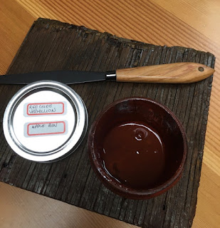
A mix of Akua brand intaglio ink in red oxide mixed with their liquid pigment in vermillion was a good starting point. And then I added subsequent layers in blends of brown and black to get the weathered look I was after.

After the prints were dry I cut them down to size, taking advantage of the knot holes and the most interesting grain.


After repeated inkings the blocks take on a wonderful patina of their own.


Often apple bins are stenciled with the name of the orchard or the packing house and at this point in finishing up some of the cards I came back to an idea I'd had for a while. What would it look like to incorporate some of that text into the print?

Have I mentioned I have a thing for text and alphabets? Luckily, the alphabet set on the top of the pile was a good size and mimicked the look of stenciled letters.

I gave black ink a try but it looked too bold and also too "new". 

Going for a more weathered look I added Van Dyke brown to the black to tone down the intensity. I also imagined the letters themselves would have faded unevenly. To get that look I tried dropping the tiniest bit of corn starch on the inked letter before I stamped it. In the test above the upper B and C was the look I'd hoped for. In a happy accident the corn starch gummed up the stamps enough I really didn't have to add any more. I also put a lid on my "perfectionist" tendencies and did a quick rough and ready application of ink to the stamps. The uneven inking added to the faded look.


I used a B and C for an imagined provincial apple packing plant and I liked the look of running the text off the print.

I tried a few other letters as well and also stamped the small prints for the back of the cards with a single letter. (You may have to click on the blog title to see the video below.)


This was one of those happy (and rare!) times when an idea that had been percolating worked out just as I had imagined! Now I'm eager to get on with a butter box print and see how I can incorporate text again yet make it distinct from the apple bin print.