Thursday, April 29, 2021

Monotype Magic

 I have a thing for pears. I love it that their shape, while simple, is both elegant and whimsical. So they seemed a good subject for a monotype. If you want the definitive definition of a monotype (as opposed to a monoprint) it might be best to look it up. For myself, I think of a monotype as ink (and nothing else) manipulated on a plate and then printed. You get a single unique image that can never be exactly repeated. If there is sufficient ink left on the plate, you can do a second pull and get what is called a ghost or detail print. But this print, while the same image, will be paler than the first pull and more ethereal. A portion of the plate may not even print.

A monoprint, on the other hand, has a repeatable property. Again, this is my definition. You can ink a lino block of a pear, say, in a dozen ways -- working into the background, lifting ink or randomly applying several colours of ink -- and the prints will all look different, each one unique. That recognizable pear lino block, though, will appear in each print. But you don't need to know any of that print geek jargon to spend a few hours -- or  a few days -- pushing ink around. 

Below is my set up. A Bosc pear with a jaunty stem, and a light-box (overlaid with a clear plastic sheet to protect it from ink). You don't need a light box -- it just makes it easier to see the manipulated ink. 


Here is my ink set-up. Using Akua Intaglio in yellow ochre I rolled up a 3x4-inch Plexiglas plate with a smooth layer of ink.


I'm afraid I didn't stop to take photos at every stage. What you see below is about four or five steps along, where ink had been wiped away and other colours rolled on. (I taped a piece of card board to the plastic covering the light box to raise the plate and make it easier to work on.) The head of the light-box is propped up a few inches for a more comfortable working angle.


Here's another in-process shot:


I'll try and recall my progression. The plate was inked in yellow ochre and then, using a square of fine cotton fabric wrapped around my finger, I wiped away the ink to leave a rough pear shape. I also defined the stem with a Q-tip. Then I took the plate to the inking station and made a single pass over the entire plate with red ink. (Note -- don't leave your brayers in this position. Rest them on the metal bar to prevent warping the rubber.)


This is a bit of alchemy involving something called viscosity, the consistency of the ink. I've heard it described as peanut butter and jelly. You can't easily spread peanut butter on jelly but you can spread the jelly on the peanut butter. Thick ink won't go over thin, but thin will go over thick. In other words, a loose ink (the jelly) rejects the stiff ink (the peanut butter). I haven't even begun to grasp the rudiments of this principle but I adopted an attitude of experimentation and pushed ahead.

The yellow ink (the stiffer ink) resisted the red (the looser ink) and the red clung only to the plate where I'd wiped away the yellow. So now I had a yellow pear against a red background. With a cloth-covered finger, I tapped a little red ink on the right side of the pear to create shading and also some dark ink on the stem. A little of that dark mix also created a shadow, to ground the pear. At first, my pears had looked like they were floating:


Here is the set-up at the press:


The inked plate goes on the press bed with the paper on top so I needed a guide to ensure even margins around the print. I used washi tape on a cutting mat.


 Inked plate in place and then paper on top.


A trip through the press and then the big reveal!


This was a early try and I hadn't rolled on enough ink. Another try, below -- still not enough ink.


Much better!


With trial and error, I improved at inking the plate and creating shadow and highlights to give the pear dimension. It's an enjoyable process inking and wiping the plate -- but slow and lengthy -- and I managed only two or three prints a day. But day by day my display wall filled with pear prints and nothing lifts my printmaker's heart like a line of multiples. Here's a short video sampler (you may need to click on the post title to view).


Thanks so much much for watching and I'll see you soon!

Thursday, April 22, 2021

A Forest Walk

A few weeks ago, strolling the creek bank through our forest, I collected debris like twigs, dried plants and fallen bark, with the idea of filling a concertina book with their prints. There was, sadly, also a good number of feathers from birds that had provided area red tail hawks with dinner.

Rather than using a traditional brayer I've had better luck inking plant material with one of those 4-inch white foam rollers from the house paint store.


And, if using Akua brand inks, which only dry through absorption, the rollers never dry out. Just slip them in a plastic bag to keep dust-free and months later they're still soft, pliable and ready to be re-used.

This is cedar, printed with a mix of red oxide and vermillion. I printed by hand, applying pressure with a Speedball hard rubber roller (the black one). Press firmly, make one pass and resist going over the print again!  In the right-hand sample you can spot the smudging from a second pass.

Below, a feather in the blue ink I'd mixed a while back. I was printing on brown wrapping paper, newsprint and other found papers. My palette was going to be this blue, the mixed red and a yellow ochre.

Quite quickly, I was entranced with the feathers and abandoned the plant material.


By this point, I'd added in a bit of grey ink. As detailed as these prints were they became much more interesting once I started re-inking the feathers with a second or third colour. In the printing process the colours would blend, creating subtle and sophisticated variations. You can see the grey mixing with the ochre in the yellow feather above.


I love the colour and detail in the feather on the right, above, and also the one below.


I use newsprint to protect the blankets when I'm printing on the etching press and I save them. Here was one of those happy accidents where the random outline of ink on the newsprint made an interesting background. After that, I started looking for backgrounds to print on. As always, one thing leads to another and where you end up wasn't where you planned to go!

Over several days I made about 100 prints and I don't think I'm done yet. I'll keep playing around re-inking the feathers, using assorted paper and choosing backgrounds. As always, if anything comes of this, I'll let you know. I might even get that concertina book filled...

Meanwhile, here's a short video of prints drying on the line. If you have trouble viewing the video, click on the post title to view in your browser.


Thursday, April 15, 2021

A Detour

I'd planned to show you what I did with that lovely blue ink I mixed a few weeks ago but I've gotten side-tracked with giving eco-dyeing a try. Eco-dyeing is using the natural pigments in plant material -- leaves, roots, bark, etc. -- to dye either fabric or paper. In it's simplest form it's nothing more than simmering the plant material in water to create a dye bath.

Since not all plant matter is safe to eat and some of it is downright toxic, it's best to have dedicated pots and utensils that you use only for dyeing. Eager to get started, I used our regular cooking pots and was careful to only experiment with edible produce like kale and orange rinds. Here fabric is simmering in an avocado pit and skin dye bath:

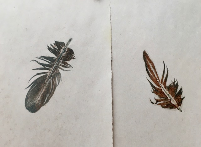
Initially, my aim was to produce ink rather than dye. Following instruction from Make Ink: A Forager's Guide to Natural Inkmaking by Jason Logan, artist and owner of The Toronto Ink Company, I tried a small batch of avocado pits and skins and got this:

Two tiny pots of ink. Not green or brown as expected -- but a rusty-peach! I added gum arabic as per the book's advice (I assume to give the liquid a bit of body) and tried it with a dip pen. With not much luck. The ink seemed too thin to cling to the nib and I got only faint scratchy lines. I had better luck with something stouter like a chopstick, below, or the trusty eye dropper, as in the quick tulip sketch.


Then I tried dyeing fabric, with remnants of white linen and cotton I had on hand, and got this:

Unfortunately, photographing the subtle colour of the plant dyes is proving difficult. You'll have to take my word I got a lovely range of soft peachy pinks.

By now I had a library book by British expert Babs Behan, Botanical Inks: Plant-To-Print Dyes, Techniques and Projects (which, despite the title, is more about dyeing fabric) and thrift store pots and utensils so I felt comfortable adding modifiers to the dye bath like vinegar, baking soda or iron water (a brackish solution obtained by soaking rusty metal in vinegar). My first try was with a fifty-nine cent carton of marked-down baby kale. The samples likely appear beige but the true colours are more towards a beige-green.

Be forewarned! This eco-dyeing is so accessible -- foodstuffs from the kitchen, plants from your own yard -- it's utterly addictive. I tried the broth leftover from cooking black beans from scratch, a big handful of the papery skins from our garlic crop, and the prunings from a Japanese barberry bush and a lilac -- with encouraging degrees of success. Here are linen samples with the black bean and the garlic.

Below, are Japanese barberry (which produced several interesting yellows -- unfortunately everything looks beige in the photos), followed by a second batch of avocado dye. This time I paid attention to the directions (like soaking the fabric in water for 24 hours before dyeing and then leaving in the dye pot a further 12 hours -- requires patience!) and got even deeper saturation.


The range of pinks and purples came from using modifiers. Vinegar pulled the pink towards orange. The iron gave those rich purples. Alkaline baking soda upped the rosy colour. So many colours from one dye source!

I'm enamored with the holistic, thrifty nature of eco-dyeing. It's low-tech and inexpensive, can be done with a cold water extraction (as opposed to using heat from a stove to speed up the process), and any water used can be returned to the garden. It gives a second life to pits and parings destined for the compost and is a rewarding connection with the outdoors. I find myself appreciative of trees and weeds and even kitchen waste! As I write, cherry bark (from a dead tree cut down for firewood), wild maple twigs, Douglas Fir cones and used coffee grounds are soaking in the greenhouse. The very definition of "slow dyeing". On sunny days it gets up to 30 degrees Celsius in there and, if I'm patient enough, that daily warmth and time will release the pigments. 

Here's the stack of samples I've accumulated so far. The colours are subtle and varied, yet harmonious. 


 This might turn out to be a short-lived infatuation but I keep stumbling across yet another eco-dyeing source. I've just learned lichens produce the most exciting purples! And that you can dye with  mud and even cow patties! Let's hope I don't go that far...

Thursday, April 1, 2021

Chasing Colour!

Take the most garish blue pigment you can imagine and mix it with brown. Then add some white. And suddenly beautiful and subtle teals appear. Who knew?

In the jar, printing ink is not that pretty. The pigments tend to look harsh, verging on the garish. To get subtle or sophisticated colour, you need to mix the pigments. And, sadly, that is a lot like sketching. To get good at colour mixing, it's practice. Lots of trial and error. And help from those with experience.

Without the generous "recipe" from a printmaker friend I don't think I would ever have discovered taking either Phthalo green or Phthalo blue (two of the most vibrant in-your-face pigments) and mixing with a brown (either raw or burnt umber) would give you anything at all. And initially it doesn't do much other than toning down the intensity of the green or blue. Which might be all your needs call for. But once you start blending in white (I used titanium) a whole world of interesting teals and aquas suddenly materializes!


This is the phthalo (thay-lo) blue mixes. 


Here I'm using phthalo green.


Below, in the background, is a card by Victoria BC artist Selina Jorgensen -- inspiration for the palette I was going for. I wanted a varied mix of green-blues plus a strong dark that wasn't straight black. Neither raw nor burnt umber worked on its own but with the addition of a bit of black I got a number of interesting darks.


I also did a set of samples mixing phthalo green and phthalo blue together, then adding burnt umber and titanium white. This mix was bolder and brighter. Even simply blending the green and blue (first swatch in the sample) created a more appealing colour than the straight pigments.


Clean-up left this image  on the glass plate I used for mixing. (The bubbly bits are soap. I'd already spritzed before I noticed the wonderful abstract!)


Trial and error, with a little instruction thrown in from time to time, is slowly helping me achieve the colours I want. If you lean to the let's-see-what-happens camp, British artist Louise Fletcher has a terrific video on taking any two or three primary colours plus black and white and mixing away. If you prefer a bit of theory, you might check out American artist Carol McIntyre and her approach. It has to do with getting a handle on "cool" versus "warm" primaries and greatly reduces the chance of mixing something resembling mud! 

After my afternoon of chasing colour I mixed the leftover inks together and got this:


Next post I'll show you what I did with this beautifully greyed blue!