Thursday, June 24, 2021

Concertina Fun!

(Oops! For some reason the videos seem to be missing. There should be two. And you may have to click on the blog title, which will open up the post in your browser, to read the entire post.)

Earlier this spring I signed up for a online concertina sketchbook course with British artist Karen Stamper. A life-long traveler, she fills book after book with market and street scenes, boatyards and ornate doorways, always with her signature loose and layered approach. With the pandemic and curtailed travel she turned to gardens and documented them, with collage and mixed media, in all their wild glory.

I was leaning towards her garden sketchbook course but ended up choosing the one on buildings. Having no interest in taking the time to learn perspective (Karen doesn't bother with perspective in her sketchbooks.) I hoped I might pick up technical tips, by some magical osmosis, for sketching believable buildings. 

In the course, long before we even began sketching, we scraped on gesso, dribbled ink, built up texture with sticky labels and our own rubbings, and blindly collaged bits of text and other papers. For me, this was a startling different way to work!

Karen works in the marvelous British concertina sketchbooks made by Seawhite. They have 35 pages (70 total if you use front and back) and go on forever! You can sketch an entire country in one book! My concertina was much more modest -- six pages -- and I planned to record the outbuildings on our property.

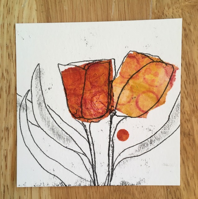
What I ended up with is messy and unformed and lacks any real focal point. Also I was working on printmaking paper which is too absorbent for the techniques Karen uses. Sturdy watercolour paper is better. Still, it gave me a push towards a looser way of working.

Here's a video -- and closer look -- of what I made. In the background you can see our woodshed, which makes an appearance at the end of the concertina.

I did look into purchasing a Seawhite concertina sketchbook but at around $50 through Amazon seemed a bit pricey. However, for years, I've kept a box of old National Geographic maps. The older maps, especially, were printed on nice paper -- heavy but soft with a matte finish. So I made my own lengthy concertina.

One aspect of the Seawhite concertinas I found interesting is the pages are doubled, so that long concertina is two layers thick. I split the maps in half crosswise, leaving each section doubled, and joined them together, pushing a full page of a new section under a full page of the old section.


I used double sided tape and stopped when I had 16 pages. 


Using a credit card I applied gesso to knock back the images and text. Later I decided to add a second coat and obliterate more even more of the map illustrations and text. For this, a brush actually worked better, letting me build up a thicker coat of gesso. 


I gessoed both sides, drying the concertina outside in the sun between layers. It looked impressively long! 


My trusty old Bernina was due for servicing so I risked running the gessoed paper through the machine, and stitched a series of random lines. As an experiment I also stitched without thread, creating lines of even holes. At the same time, I reinforced the joins with stitching and realized, rather than using tape, it was easier to stitch the pages together (pre-gesso). And that's what I did with a second smaller concertina I made for our five-year-old granddaughter. Hope you can make out the stitching on mine in the photo below.


Channeling the looseness and randomness of Karen's class, I created a foreground with black sumi and ochre acrylic inks.


At this point I wasn't exactly sure what I making.


On a whim, I flipped the concertina up-side-down and suddenly the foreground became a sky and distant hills.


With the stitching at the top there was now an uninterrupted swath for sketching. First, though, I laid down bits of random collage -- a few old prints, text, hand-patterned paper, whatever I found in my stash in black, grey or ochre.


With the heavily gessoed surface I needed a sturdy nib for drawing and chose a black Tombow pen. And then spent the happiest Sunday morning simply sketching plants in our garden. One by one, the pages filled up.


I started partway into the book and, at first, my drawing was tight. Took a bit to get used to the bold black line of the Tombow pen. Then I relaxed into the drawing and -- surprise! -- the sketching got better. And easier. There's a lesson in there somewhere!


These peonies look more confident to me and their stems took advantage of the strips of collaged paper.

Along the way I discovered the Tombow pen was not waterproof and decided to make the best of that. I needed something to help the plants stand out from the background and, with a wet brush, pulled some of the ink of the drawn line into the petals and leaves. You can see the resulting grey ink in the earlier lady's mantle photo and here:


Then a funny thing happened. You likely can't see it in the photo but the Tombow ink had a decidedly blue cast and I didn't care for it with the graphite greys in the sky from the sumi ink. So I drew lines into the sky with the Tombow, wet them, and blended in the blue-grey. I also worked a bit of grey from the watered-down sumi ink into the plants. The mixing and blending of the greys made a more harmonious whole for me. With the underlying collage and the blend of greys, one of the iris petals made my heart sing!


Rather than risk mucking up the book by printing directly on the rough gesso, I stamped the plant names on white tissue and glued them in place.


Below is the sketchbook I made for our granddaughter. It's about 5x7-inches and mine, for comparison, is 7x9-inches. The smaller book is made from maps of Texas and I loved leaving the long-horn cow showing. Especially since there is a small herd of long-horns close to our granddaughter's house.


I got the "brilliant" idea to pop the small concertina in my book press and give it a good squish. Kids, don't try this at home! Even thought the gesso was thoroughly dry the book came out absolutely sandwiched together. I had to carefully pry each page apart and, even then, several of the pages tore and had to be re-gessoed. But look at the wonderful texture!


Think I might do this deliberately with the next map concertina I make! If you're still with me -- this post is as lengthy as the concertina -- here's a video of the completed sketchbook.


See you soon!

Thursday, June 10, 2021

Composition

Carrying on from the last post, here is a short update with a few more variations on the landscape print:


It was fun and enlightening to easily move components and then stand back and evaluate. That last one, above, doesn't work for me. Pushing the tree out of the picture makes it too dominant and heavy-looking. Perhaps it might be balanced by moving the moon to the left... There are endless possibilities in just this one little image.

Composition is basically the arrangement of visual elements. And there are lots of "rules" such as to put the focal point somewhere other than dead center and odd numbers of objects are more interesting than even numbers. But these rules are really more guidelines and I'm enjoying "bending" the odd numbers rule.

Three objects, especially in small works, has become so routine and expected I'm finding working with two objects gives me a fresh and energizing perspective. And there is something about pairs that speaks to me.

The following are just quick and rough studies made with scraps on my worktable. The first one is a trace monotype (drawing on the backside of an inked piece of wax paper) over some tissue collage.

In the next one I've added small diecut foliage cut from black card to see the effect of an overprint of a linocut. Before I go to the trouble of carving a block I can get an idea if it will be a technique worth exploring. I think the composition is a bit better in this second example -- with the one tulip tucked in behind it creates a variation in size. That's a new "rule" I recently came across -- twos are okay but they shouldn't be the same. Although I'm drawn to the graphic quality of almost identical objects.

Remember those Wonky Pears from awhile back? This one, in particular, ended up higher than I would have liked. It was the levitating pear!


I reworked the background to put in a horizon and now I'm thinking the pear looks more grounded. Perhaps it's sitting on a table...


Possibly I should have left it alone at this point but I narrowed the edge with gesso and got this:

Still looks like it's floating! Will play around "fixing it" until I wreck it! Seems I have to go too far to learn how far is enough. Guess that's why art is endlessly interesting and compelling! See you in the next post.