Apologies for the word play but it was hard to resist! I haven't spent much time in the studio lately. The garden is calling and I'm still infatuated with using plant material to dye fabric. As I write, linen and cotton samples are soaking in the warmth of the greenhouse in a dye pot of stinging nettle. For the first time, I'm eager for the ever-so-invasive mint to make a show -- it's supposed to be a good plant for the dye pot. And so is lemon balm, another troublesome self-sower. Meanwhile, I thought I'd share the process for what I call my "Wonky Pears."
They start with a loose collage of small squares of the Saturday Globe & Mail newspaper which my thoughtful friend Nancy saves for me. I look for text on an ideally solid-coloured background. Like these:
To counter my precise nature I quickly chop the paper into roughly 1-inch squares.
And, just as quickly, glue them down on a 5x7-inch card blank, ending up with a rectangle and a somewhat even border.
I add a smaller collage for the back of the card.
I could be spontaneous and simply glue down the squares as I pick them up. But I wanted a good mix of the text for the body of the pear and found it useful to lay out the squares on a spare card, as below, and then transfer and glue them one by one.
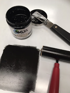
Then I roll out some black ink and ink a piece of wax paper. I'll use this to transfer my drawing, a technique called a "trace monotype". You could ink up pretty much any type of smooth non-absorbent surface like parchment paper, a foil potato chip bag, even a plastic grocery sack but California printmaker Anne Moore suggests wax paper and I like how it allows you to see the drawn lines from the back. Here I used Akua Intaglio in Carbon Black, a warm yet intense black.
To protect the white border of the card from ink smudges I use a protective paper frame. Some artists like the smudges but I find them distracting.
I also lay an identical paper frame on top of the inked wax paper as a guide to center the drawing in the collage.
Then I take a deep breath and blindly draw a pear. That's how they got the name "Wonky"! I can't really see what I'm drawing, although enough of the drawn line becomes visible on the back of the wax paper to guide me. You can draw with anything -- pencil, chop stick, ball-point pen, end of a paint brush -- and vary the thickness of the inked line. For example, a stubby carpenter's pencil with a dull point gives a strong, bold line. I used an ordinary HB pencil.
The wax paper is flipped, below, for a clearer view.
Here's a test drawing:
I didn't get the best bottom on the pear. With a bottom like that, it would tip to the right. This one was better:
Someone asked me why I don't simply draw the pear on the collaged rectangle. I tried that and, to me, the drawing lost energy. The risk of drawing blind translates to a looseness I like. Also there is a unique quality to the line itself that can only be had by the transfer of ink. That's the appeal of trace monotypes -- that soft, slightly burred line.
Now you don't have to draw free-hand like I did -- you can trace an existing drawing. Or even a photo. For excellent and inspiring examples, check out Belinda del Pesco, another California printmaker.
This is as far as I planned to go. Chop up the text, lay down the collage, ink the wax paper and draw a pear. But I was disappointed in the result. Something was missing. The pear didn't really stand out against the busy-ness of the collage. It happened that I had some white gouache (opaque watercolour) on hand. Using a small brush and the gouache thinned with a little water, I started to paint out the background and liked how just a little bit of the collaged newspaper showed through. And I also particularly liked how the gouache highlighted the edge of the collage (bottom of the photo).
One thing I forget is that gouache dries darker (watercolour is lighter after it dries) and I might have preferred a bit more of the collage to show through. More like the next example (I'm having a think if I leave it this rough or tidy it up -- leaning towards the rougher and looser background.)
On some cards I also did a small version of a pear on the back.
It was time-consuming and there was always the possibility, after the work of completing the larger pear on the front, of screwing up the drawing and/or smudging the ink. So I carved a little pear from a scrap of soft-cut rubber and now stamp the back of the cards.
Then a friend came by and said the Wonky Pears were crying out to be matted for framing. We dug out a mat and had a look and -- darn! -- they looked good! Thanks, Elizabeth!
Here are some waiting to be matted:
And with mats:
And one I framed for my kitchen:
For now that is the end of posts on pears but I'm sure pears will make an appearance again somewhere down the line. Maybe even a pair of pears. Or perhaps pared pears...
Sorry.


