Thursday, July 21, 2022

Pretty in Pink

 (To read full post, you may need to click post title to read in your browser.)

I was at loose ends in the studio one afternoon and felt like just making something pretty. I dug out these rubber stamps I'd carved way back in 2015. (I date-stamp my workbook or I'd never remember when I did anything!).

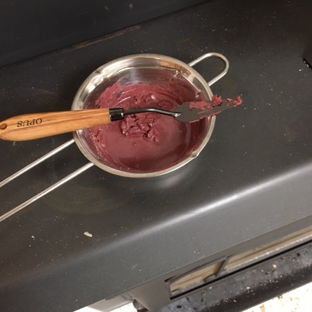
Working on inexpensive calligraphy paper and using leftover reddish "mystery mix" ink, I stamped a random pattern. Occasionally, without re-inking the stamp, I'd stamp again, going for a sort of shadowy background.

I tried to be mindful of the negative space -- the white background -- but I didn't want to overthink things. So mostly I simply stamped away.


Still, think the first print has a better composition than the second one below. These casual prints often end up being used for book covers so I try to remember to print at least two sheets that go together.

I've been playing around, the past month or so, adding a modifier to the ink to make it more transparent. A bit like thinning paints with water to get those lighter values. I wondered if I'd lose the shadows in the background if I rolled over the print with a very transparent mix of the red ink (pushed to pink now). So I printed a third sheet.

Rats! Just realized I forgot to photograph the print one step back! Try to imagine it without the dark flowers. The darker pink is the first stamp. The paler flowers are the second stamp without re-inking. And then the overall pink is a roll of the reddish ink mixed with enough modifier to make it pale and transparent.

Then I wondered what would happen if I mixed a tiny bit of black ink with the original red and stamped a final layer.


Hmmm? Not sure the dark on top added anything. But I wondered if the dark went on first, then the red, then the roll of transparent colour over everything, what I would end up with. But I was beginning to run out of steam -- and time -- so that will be for another day.

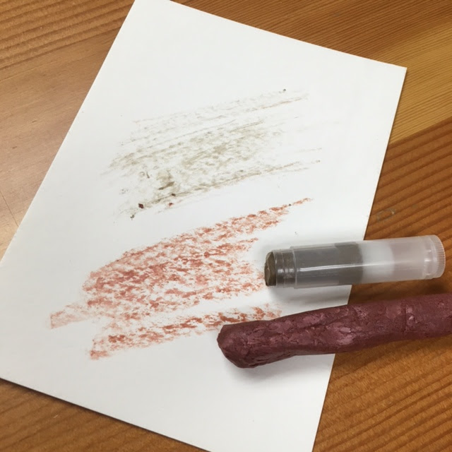
However, when I started to clean up, I noticed this:

This is the newsprint underneath to protect the work surface. The calligraphy paper was saturated with ink by the time I got to stamping the dark flowers. (I really should have given the print a week or so to dry before I carried on, but I didn't!) Look at how the inks bled through the calligraphy paper into the newsprint. Here's another example:

I couldn't resist cleaning off the brayer on the newsprint and adding to the pattern. This is what I got:

There is something here that appeals -- like looking through sheer curtains at a tree in full blossom. Will likely tinker with it and do more overprinting or maybe chop it up for collage... It's too pretty to toss!

And then, the next morning, the first two prints were dry.

And they became this -- covers for a concertina:


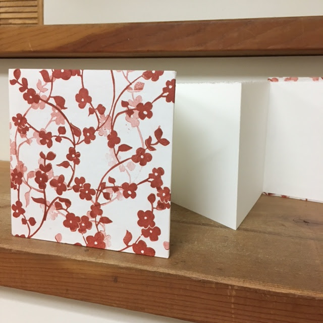
If you remember this post describing how I make my concertinas you might notice in the above photos that I'm no longer cutting the board for the covers a good quarter inch larger than the paper. I didn't like how the paper sagged when the concertina was open for display. Now I'm trying for a border closer to a fat eighth of an inch -- tight enough the sag on the open concertina is minimal and yet generous enough that it's still easy to center the paper on the cover.

Now what to make with that pretty concertina? Hmmm...

Thursday, July 7, 2022

Crayon Side Trip

(To read full post you may need to click post title and read in your browser.)

 I love libraries. The Internet is fabulous for looking up stuff and finding any number of tutorials and advice on any number of topics but there is nothing like paging through a real book. A while back I discovered Nick Neddo, a Vermont artist, whose bio says his life-long pursuits are the "study of the natural world, Stone Age technology (popularly known as primitive skills) and creating art."

His books focus on making your own art supplies from nature -- everything from charcoal sticks and inks to brushes and paper. Including crayons. I don't use crayon much in my work but I did have some of the necessary bees wax on hand and popped it on our wood stove to start melting.

The instructions call for creating a very fine pigment by grinding stone. I, however, had come across some old mineral-based cosmetics -- a pinky blush and a taupe eye shadow -- and wondered if they might work instead.


Neddo uses hollowed natural twigs for his crayons but I had the idea of using old lip balm tubes and making roll-up crayons. 


Above, you can see the melted wax with the blush powder mixed in. I suspect I went a little heavy on the powder. Neddo warns that can make for a crumbly crayon. Even with more time on the heat, I couldn't get the mixture to liquefy. So the lip balm tubes were out. Instead I scooped the wax onto a sheet of baking parchment.


A few minutes on the stove softened the wax and then I attempted to roll it into a cylinder shape.


Looks like toffee!

The eye shadow made a runnier mixture and I was able to fill two lip balm tubes. Now I had a chunky pink crayon and the two tubes of shimmery taupe.


Didn't achieve much colour with the eye shadow. The blush crayon was better. But not much return for the effort. Will I pursue this and go as far as grinding stone for pigment? Probably not. But the paint brushes made with animal hair and a feather ferrule sound intriguing. I could give that a try -- the books aren't due back at the library for another week! (Disclaimer alert -- It's a few months later and I still haven't gotten around to attempting making my own brushes! Sigh... this winter maybe?)