Thursday, July 29, 2021

Short and Sweet

(To read full post you may need to click post title and view in your browser.)

Remember this little print that I had initially rejected and then decided I liked?


The other day I couldn't settle on anything in the studio so went to the garden, gathered leaves and pressed them in a telephone book for a few hours. Rummaging through a file of "backgrounds" I discovered a few in similar colours to this one. Here are some test prints:


I inked the leaves with carbon black (an intense black) and hand-printed using the pressure of a hard rubber brayer and some judicial rubbing with a finger along the stems and veins. These are cranesbill leaves:


Sage:


Always think I'll remember what and where I picked -- but I don't! Not sure what these are:

Nor these:
:

Here's a group shot.


And paired with brown kraft envelopes which seem to go with the botanical look.


And that's it for this week's post. Maybe not sweet but definitely short!

Thursday, July 22, 2021

On the Line with Feathers

(To read full post you may need to click post title and view in your browser.)

Continuing on from several weeks ago with inking feathers found in our forest or along the roadside, I was taken with the depth the multiple colours produced.


The feather below was inked in the grey-blue and printed. Ho-hum.

Another feather, inked with two colours, is a bit more exciting.

I find I need to ink and print each feather several times to build up enough saturation of colours to get a successful print (successful, as in a print I find pleasing). Quite quickly, though, the soft fluffy part of the feather begins to mat and clump, as you can see above.

For awhile I can separate the clumps with a pin but there quickly comes a point when the feather is done for. You'd think it would be a simple thing -- find a feather, ink it, print. Done. But natural stuff like feathers and leaves are notoriously difficult to print cleanly with no smudging or "halo" effect (caused when there's the tiniest bit of movement during printing).

So I print and I print, culling out the "duds", and am really happy if three-quarters of the prints are crisp and clean. This session went well and I ended up with these:

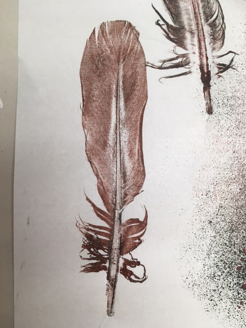
Here're two close-ups:


One thing with printmaking is the need for a lot of drying space! I've got a double clothesline in my studio and can peg up a good number of small prints to dry.

I also have these wire trays from a fruit dryer my husband build back in the seventies when we were first married and flirting with the back-to-the-land movement. The ancient electric heater we used caught fire and we lost our enthusiasm and dismantled what was left of the plywood dryer. But I kept the trays all these years figuring they'd come in handy one day.

Since I tend to work small this old re-purposed record rack holds about 4 dozen prints.

And these salvaged metal office sorters mounted under my work table come in handy.

I also purchased a rack on-line that's good for larger prints. Designed for elementary school art classes it's inexpensive (compared to professional print racks) but there are only two crossbars per wire shelf. Larger work might not lay perfectly flat and small work falls through but, if needed, I can layer each shelf with a sheet of poster-weight card stock.

I had the idea of storing the rack in a closet when it wasn't in use and my accommodating husband came up with a way to hang it on the side wall. It's easy to take down but I discovered the prints dry just fine in the closet. 

Can you believe, though, with all these drying surfaces, sometimes I still end up using the floor? There is some truth to the idea no matter the size of the studio, it's never big enough!

Thursday, July 8, 2021

The Challenge and Beauty of Printing with Nature

(To read full post, you may need to click post title and view in your browser.)

Enduring the recent heat wave means nothing much has happened in the studio. Thought it might get me going again to look at past work with the hope the journey might interest you, too.

As I mentioned, printing with live plant material is challenging. If it's too fresh, plant juice will squirt and stain your print. (I've been told direct sunlight may fade the stain but I haven't tried it yet for myself.) If it's too dry, it will crumble and the dried bits will gum up your inked brayer. The tiny seeds in grasses will do the same. And the uneven dimensions of leaves and flowers and other plant material can easily create distortions and smears in the print.

In the print below if you look closely at the tips of the oak leaf you will see a slight double-image.


If you're interested, the background to the card was created using a sheet of poly-styrene (one brand is Scratch-foam Board). Picnic plates and the foam trays used for things like take-out sushi can easily be substituted. The material's soft surface is easy to draw into and to texture. I used a dull chopstick to mimic a birch bark pattern.


Sorry for the glare. Here is a close-up:


I used cream ink and printed on light grey cardstock. When that layer was dry I inked the fresh leaves (pressed in a telephone directory for a few hours beforehand) in red and overprinted the birch prints.

One year I sent these out for Canada Day and had fun using a 3-colour blended roll:


The next photos are from a series I made to use up some of the 500 A4 (about4x6-inch) envelopes I bought by mistake. To get two card blanks from one 8.5x11-inch sheet of cardstock, I trimmed each card to 11x4-inches.And then folded at the six-inch mark. This created an off-centre fold with the opportunity to reveal a bit of a teaser print under the flap.


These are nasturtium leaves.


I also printed across the back of the card, multiplying the odds of screwing up the print! But I enjoyed creating the compositions and pushing the paler leaves into the background. I used the same ink (Payne's Gray) on grey cardstock on standard cards (4.25x5.5-inches) as well. Much easier to use the British system and call this size A2 rather than typing the dimensions!  


Did some in white on tan, with a Red Gate chop (a gift carved to order in Vancouver's Chinatown.) The pamphlet stitch makes an appearance!


A sample from another series I did incorporating bits of collage:

The following photo is from early, early days when I was still using Speedball water-soluble inks. Got some wonderful effects blending black with their metallic gold.


I recently unearthed the stuff below during a studio tidy. Instead of printing the leaf I'd used it as a mask and printed over random bits of paper, mostly clean-up paper from other print projects. Always a thrill to see what is revealed under the mask.


At some point, these might be the start of a concertina book. To wrap up, thought I would share a few recent plant prints.


This is sage flower inked in black. Below, inked flowers in place for printing. I cover with newsprint and make one -- firm! -- roll overtop with a hard rubber brayer.


Below, you can see a bit of plant juice stained the top of the card. Maybe it's time to try the sunlight trick...


These are looser and messier than my usual prints but this is apparently the direction I'm heading! I was about to discard the one below, then cropped it and decided I liked the variation of ink in the print. Reminded me of an old-fashioned botanical etching.


Thanks for coming with me on this wander down Memory Lane! See you again soon!