(To read full post, you may need to click post title and view in your browser.)
Enduring the recent heat wave means nothing much has happened in the studio. Thought it might get me going again to look at past work with the hope the journey might interest you, too.
As I mentioned, printing with live plant material is challenging. If it's too fresh, plant juice will squirt and stain your print. (I've been told direct sunlight may fade the stain but I haven't tried it yet for myself.) If it's too dry, it will crumble and the dried bits will gum up your inked brayer. The tiny seeds in grasses will do the same. And the uneven dimensions of leaves and flowers and other plant material can easily create distortions and smears in the print.
In the print below if you look closely at the tips of the oak leaf you will see a slight double-image.
If you're interested, the background to the card was created using a sheet of poly-styrene (one brand is Scratch-foam Board). Picnic plates and the foam trays used for things like take-out sushi can easily be substituted. The material's soft surface is easy to draw into and to texture. I used a dull chopstick to mimic a birch bark pattern.
Sorry for the glare. Here is a close-up:
I used cream ink and printed on light grey cardstock. When that layer was dry I inked the fresh leaves (pressed in a telephone directory for a few hours beforehand) in red and overprinted the birch prints.
One year I sent these out for Canada Day and had fun using a 3-colour blended roll:
The next photos are from a series I made to use up some of the 500 A4 (about4x6-inch) envelopes I bought by mistake. To get two card blanks from one 8.5x11-inch sheet of cardstock, I trimmed each card to 11x4-inches.And then folded at the six-inch mark. This created an off-centre fold with the opportunity to reveal a bit of a teaser print under the flap.
These are nasturtium leaves.
I also printed across the back of the card, multiplying the odds of screwing up the print! But I enjoyed creating the compositions and pushing the paler leaves into the background. I used the same ink (Payne's Gray) on grey cardstock on standard cards (4.25x5.5-inches) as well. Much easier to use the British system and call this size A2 rather than typing the dimensions!
Did some in white on tan, with a Red Gate chop (a gift carved to order in Vancouver's Chinatown.) The pamphlet stitch makes an appearance!
A sample from another series I did incorporating bits of collage:
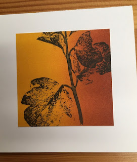
The following photo is from early, early days when I was still using Speedball water-soluble inks. Got some wonderful effects blending black with their metallic gold.
This is sage flower inked in black. Below, inked flowers in place for printing. I cover with newsprint and make one -- firm! -- roll overtop with a hard rubber brayer.


