(To read full post, you may need to click post title to view in your browser.)
Crazy carrot collage -- try saying that three times fast!
Lately the need to make something bright and cheerful has been calling and, with summer full-on, gardens and farm markets are overflowing with colourful produce. I grew up in a time when carrots were orange and that was it. Now we have a rainbow of heritage varieties. Perfect subject.
I'm using hand-coloured tissue here. I love how the white of the paper shines through the translucency of the tissue and makes the colour glow. A word of caution: If you have a choice, don't use gift wrap tissue. It takes ink and acrylic just fine but it's not strong enough to handle the glue for collage.In the photo above, see the white speckles on the dark orange carrot? That's where the tissue shredded, even with a gentle application of glue stick. Try to get tissue from an art or craft store. It's so much stronger and only a few dollars for a pack of 24 big sheets.
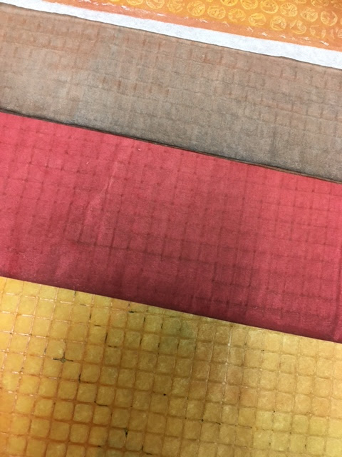
These are a sampling of hand-stained tissue (or calligraphy paper -- still thin for collage but a little more opaque):
I got the lovely grid texture by drying the painted tissue on a sheet of wire. Back to the carrots (which I've just realized are orange -- but I plan to do pink, purple and yellow, too). Below, I'm seeing if I want to add shading with a deeper tone of tissue.
Here, a speck of tissue fell on one of the carrots and I wondered what it might be like to deliberately add more -- a sprinkle of confetti!
Always fun to pop a small image on the back of the card. And then the part I enjoy the most -- adding the line!
I used a black Sharpie No-Bleed fine-liner. And discovered the green paper I used for the carrot tops was not tissue but deli paper. It takes acrylic paint great but resisted the Sharpie. Turns out I have every colour of tissue but green so I moved on.

Here I am back in familiar territory. Give me half a second and I turn to the dark and sombre colours. I have no green papers but I have every shade of grey! Not sure what that says.
The pink paper is an envelope and the grey is an old book page. At this point, I'm simply experimenting -- tissue or thicker paper, added line or no line, shading or none... But I got so absorbed I glued down the carrots in the wrong position. I had wanted them to cross. So then I challenged myself to make the composition work and added a third carrot.
Jury is out on whether I made it any better. Not thrilled with how the large carrots are parallel. At this point, though, I'm simply making prototypes. Seeing what works and what doesn't -- what excites me and what doesn't.
Here I made a photocopy so I could compare a version with line (left) with no line. Thinking I prefer line with the tissue but that the opaque papers look better without. One thing, acrylic paint is hard on the pen so I wouldn't use anything expensive, like the lovely Faber-Castell PITT artist pens with their sensitive and easily-damaged nibs.
Back to colour here. Didn't like the orange carrot showing through the pink so tried this:
Added torn tissue overtop to block out the orange showing through. With the thin tissue, it's easy to build layers without adding bulk. And the sheerness makes it a bit like using translucent watercolour -- the layers blend and create new colours.
Found a bit of green tissue. Now, line or no line?
Went with line but then wondered about no line on the green top. Again, a colour photocopy came in handy. The greens, to me, looked a little lost without the black line. I tried something different and outlined them as one big shape, as you can see above. Didn't like that but discovered I did prefer outlining the big shape first and then adding the dissecting lines for the individual stems.
This is not a fast process! Here is the entire afternoon's production:
If I carry on, I'll let you know. Meanwhile, thanks for reading! See you soon.