(To read full post you may need to click blog title to view in your browser.)
This is another studio afternoon warm-up exercise. Once again, I started with an old art magazine -- often the paper is of exceptional quality -- and the images are inspiring company!
I cut down the pages to my standard 9x9-cm squares.
For a while I worked with Akua Kolor, the liquid version of ink developed for monotype work (now that Speedball has acquired the company it's called Akua Liquid Pigment). Didn't get the best of coverage and, like the thicker Akua Intaglio ink, it was going to take ages to dry.
I switched to acrylic paint and picked plums as my subject. I love the look of plums (they come in such a gorgeous array of colours, all the way from pale green to midnight indigo) plus their size and shape suited my small squares. Truth be told, I picked plums because I have a bunch of plum back-of-notecard labels needing to be used up.
I rolled up a small Plexi-glass plate with white paint and then used a chopstick to draw a loose sketchy plum -- sometimes I wiped out some of the white ink with a cotton swab and/or a small piece of cloth -- and pulled prints with the magazine squares.
The blue you see above is the colour of the Plexi-glass plate. And here's a tip -- a silicone baking sheet holds the plate secure for inking up -- AND -- resists ink so if the brayer goes off the plate there is very little cleanup!
I loved how bits of the underlying image would show. With happy accidents sometimes a perfect chit of colour would be revealed in a leaf or the curve of the plum. However, at day's end, I felt too much of the original magazine image was revealed and that the art work featured was recognizable.
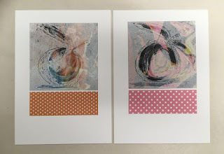
Still, I played around with the prints anchoring them with a strip of paper. The cheery commercial polka dot papers on these two post cards made me feel happy! Then I tried some with my own hand-printed paper and a tiny bit of collage.
With one of the prints I was especially happy with how the image was obscured yet the revealed colours added so much to the print. Again, just the image popped onto a 5x7-inch card looked a bit lonely and unfinished.
I played around with different solutions and quite liked anchoring the print with a quick underlying roll of ink.
Apologies for the so-so quality of my photos -- overhead studio lighting is not the best. Hoping you can see the swatch of orange ink picked up the colour revealed in the leaf and carried it down through the composition.
The next time I was back in the studio I set about creating a background with similar colours to the magazine image. I printed this time with Akua Intaglio inks on some lightweight but robust calligraphy paper. Had to wait a few weeks for the squares to dry then had a go with the same plum monotype.


