Thursday, June 23, 2022

Assembly Line

 (To read full post you may need to click post title to view in your browser.)

Following up on the last post, where I happily chopped up colour copies of three old acrylic sketches I'd found in a box of junk papers, this is the further adventures of those bits and pieces.


The squares (for 5x5-inch notecards) are 9x9-cm. The rectangles (for 5x7-inch cards) are 9x14-cm. And the bits for the backs of the cards are 3x7-cm. It's always fun going through the scraps searching for these tiny landscapes.

Although I do use purchased Strathmore card blanks (either printmaking or mixed media), I often cut my own blanks. I like Staples 110 lb cardstock, but sometimes, especially for 5x7-inch cards, it's a little light. Couldn't source anything locally but did find a heavier weight on Amazon -- 120 lb -- something by International Paper called Accent Opaque Digital. 

I cut down the 8.5x11-inch sheets on the trusty paper cutter. Off-cuts get re-purposed or shared with a daycare for craft projects.

Then it's off to the equally trusty hand-made scoring board.

I use an old wooden butter spreader. One drawback to using heavy cardstock is that it resists scoring. So it's three firm scores, being careful to not get carried away and slice the paper. Then fold along the scored line, which is a bit of a battle. The paper is long grain meaning it likes to be folded east to west. The fold then goes the length of the paper. But I need to fold north to south so the fold is going across the grain. That's when you get those ragged, unruly folds. You can see the rough fold below:


This is where a Teflon folder comes in handy. They're pricey but they don't mark the paper the way a bone folder can. (They're wonderful for creasing dark-toned papers that tend to show every pressure mark.)


The photo above shows the rounded side. This is the side I use for teasing the fold until it's smooth and crisp. Think the shape also helps reduce marking the paper. Note: I only cut the card down to 7 inches wide, do the fold, and then trim off that last inch. Let's me correct little inconsistencies that way. Have I mentioned my nit-picky tendencies? Or attention to detail, as I prefer to call it!

When I have a stack of folded cards off they go to my beautiful book press (an astonishing and totally unexpected gift from a woodworker who always wanted to have a go at making an old-fashioned screw press). Overnight or even a few hours helps set the fold.


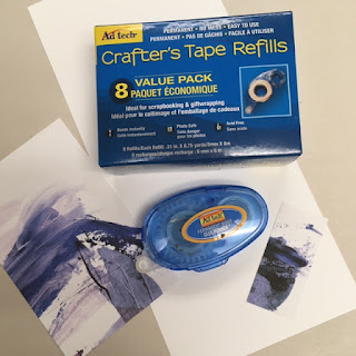
Then it's taking images that made the cut, and mounting them. I use either a glue stick or this tape a lovely friend gave me. The drier the adhesive, the better. Less chance of wrinkling.

Love watching the production accumulate!


The last bit was stamping my website on the back.


I eyeball both mounting the images and stamping the back of the card. (I've gotten smarter and now stamp the blank card first. Then if I screw up the alignment I haven't wasted an image. If that does happen, then I cut off the back and use the front as a postcard. Waste not, want not, as they say...

If you've stuck with me this long, big applause! Thank you! The gist of the post was to document some of my process after the art is created. I enjoy every stage involved in making my mail-sized missives -- from working out an idea all the way through the folding, scoring, labelling and packaging. There's never a bad day in the studio! Now it's signing and packaging time.

Another great day. Talk soon!

Thursday, June 9, 2022

Searching for a View

 (To read full post you may need to click post title to view in your browser.)

While digging through a box of old papers I found these quick 9x12-inch acrylic sketches I did while following along with a video by British artist Lewis Noble . (Sorry, couldn't locate the exact tutorial but the inspiring mix of calmness and energy Noble exhibits while painting make any of his abstract landscape videos worth a watch.)

As always, when I come across old work, I can't wait to chop it up! 


Using a 10x10-cm viewfinder I hunted for interesting compositions. Then, before chopping, had the foresight to make colour copies so I could play around with a number of views.


But the yellow ink seemed to have jammed (I have nothing but headaches with my new printer -- and it can't all be operator error!)

Still, with the absence of any yellow pigment, I got some amazing colours -- those pinky-blue mauves! In fact, think I prefer the monotone images to the original. (Originals have yellow -- copies have pink.) With lots of photocopies in hand I could freely experiment with cropping. 

Slightly lower horizon or higher, as in the photo below:


Or half-an-inch this way or that:


Don't think the leaf-shaped break in the cloud looks good pushed hard to the left. Middle image is okay but like the one on the right the best. Multiple copies to chop up makes playing around with all these slight variations in compositions and views possible.

Here are two vertical images:


Initially preferred the one on the left but there's something drawing me to that lighter purple monolithic shape on the right. I see mountains and massive rock. Below are three almost identical images but cropped at different angles. Once I stopped using the viewfinder in a strict north-to-south orientation a whole world of new compositions opened up.


It was a challenge to crop an image I liked in the painting with with the big grey smear on the left but I like this one:

Since I was on a roll and hadn't run out of enthusiasm I went to run off a few more photocopies. Gave the yellow ink a bit of a jiggle and -- darn -- it started to work. Sort of... I got yellow but the colours are not at all close to the original paintings. Almost as if the printer was not yet getting enough of the pigment. To my eye the green and yellow are dull and insipid compared with the original on the right.

Even these dull copies, though, made good fodder for the big chop!

Above are two horizontal compositions. The bottom one is pulled a bit to the right to bring in that lower corner of white. In the photo below, I compared a horizontal layout to the vertical.


Here's a square version:

Interestingly, I found playing around with the least favourite of the three sketches the most freeing. Perhaps I had less emotional involvement and looked for compositions with a more unbiased eye? Or maybe there was less to lose since I didn't feel attached to the original image?

Anyway, at the end of the day, there was a nice stack of "potential" piled on my work table. And there was also a huge amount of off-cuts (second photo) that hadn't offered up any crops of interest.


But they provided tantalizing scraps of colour and texture:


I'll be playing around with these for sure and if anything comes of it, I'll let you know. See you soon!