Thursday, September 30, 2021

Sketching Again!

(To read full post you may need to click on post title to view in your browser.)

I've gotten away from the daily sketching. I knew it had been a while but was chagrined to discover my last sketch was back in February. Here it is, in all it's glory:


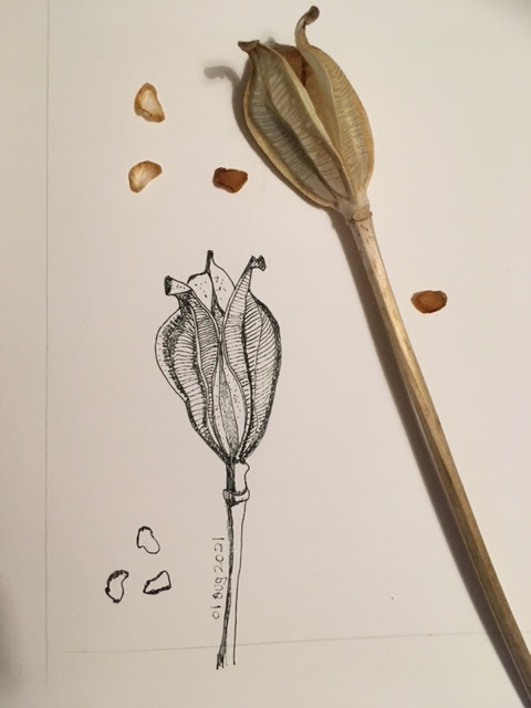
It took until July to get going again. I sketched these dried iris seed heads sitting in the garden and then added a little walnut ink back in the studio.


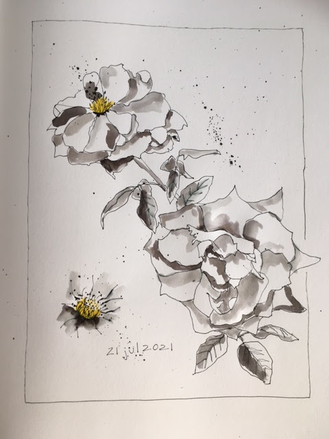
Felt so rusty! Slowly, though, I started getting back into the rhythm. These beauties below are from my friend Nancy, who is so generous with her extravagant rose garden. Loved the pop of the yellow pencil added to the ink and water drawing.


Plants are my favourite subject to sketch -- likely because their organic shapes are so forgiving to draw. Every now and then, though, I challenge myself. Drawing in ink, I find symmetrical objects, like the spoons below, difficult. 


I did "cheat" a bit and drew vertical lines lightly in pencil for each spoon to give a bit of a guide. Still, the spoon bowls ended up lop-sided! The horizontal spoon was first sketched in pencil and I did a fair bit of fiddling to get the bowl even. Only then did I draw over in ink.

I spent a few more days on symmetrical stuff and then went back to the garden. I'd been watching these hosta flowers and when they were on last days I brought them inside.


If I have a subject in mind, I'm more likely to do a daily sketch. So I often take a few days to finish a sketchbook page. Two days for this one.


The sketch below was spread over five days:


Here is a four-day page:


And another one -- the paint box looked so simple but once started I got caught up in the complexity of the hinge and all the indents for the paint and the sponges. If I've learned anything, though, it's to keep going. The finished sketch isn't important -- it's the practice getting there.

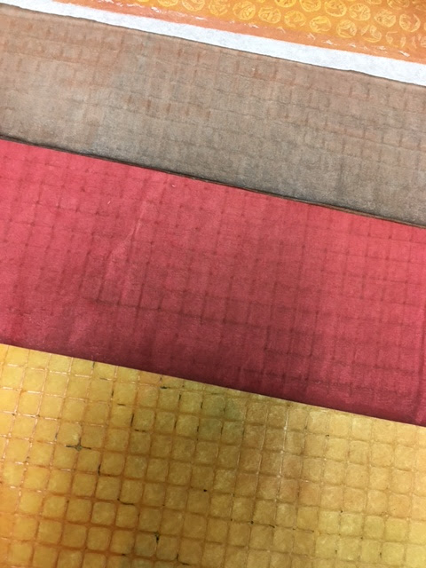
I really enjoy laying down some hand-coloured tissue and then sketching over top with ink. The white of the paper makes the colour of the translucent tissue just pop!


I used a black brush pen to get the heavier thicker lines -- thought they showed up better than the thin lines my regular pen makes (like in the top tomatoes). I seem to be back in the rhythm now. Here are a few recent sketches:


Not so sure about this last one -- my shapes are a bit off. A challenge to catch the curve of the dried pods.


The trick to a daily sketch, unfortunately, is to sketch daily! Sigh... But sketching has much in common with exercising -- both will be part of my life for many years to come -- so if I miss a few days (or, yikes, longer) at some point I just start up again. Happy sketching!

Thursday, September 9, 2021

Hang Tag Fun!

(To read full post, you may need to click post title to view in your browser.)

The other day I watched a video on Linda Celestian's YouTube channel. Linda is an American artist with inspiring tutorials for making your own hand-painted collage papers but this particular video was about making a garland from hang tags -- those often beautiful and creative tags attached to clothing, kitchen linens and other consumer products. Her video reminded me I had a stash.


When I dug out the box I discovered a handful of collaged notecards I'd started playing around with years ago.


Here are a few close-ups (excuse the glare from the overhead lights):


I seem to have moved past making these little collages yet that pile of tags with their gorgeous graphics and imagery still calls to me. Take a look:


Love the narrow tag attached to this skirt tag. Anything black and white always attracts me. Add in text and I'm hooked!

And look at these darling tags:


These are from a line of Danish clothing for children. Beautiful art work! And then I have a few leather and fabric tags:


It's fun and educational to look back on old work -- to see what drew me then and where I am today. I'm not sure I'll continue with the tag collages -- but it would be a great one-a-day project come winter! And since I have such an abundance of tags on hand there might be a garland -- or two -- in the future. 

Thursday, August 26, 2021

A Short but Happy Adventure with Squares!

 (To read full post, you may need to click post title to view in your browser.)

There is something about a grid that intrigues me. When looking for a diversion I often spend a few gleeful minutes with my trusty paper cutter. A little print had been floating around the studio for a few weeks. It was a nothing print -- I'd used a leaf shape as a mask and then, later, doodled overtop with sumi ink. It wasn't an improvement but I did love the combination of the slightly greyed orange background, the weird grey veining of the leaf and the sharp contrast of the rich black ink. Unfortunately, I got chopping before I thought to take a picture.

Here, though, the middle square will give an idea:

I love a mix of organic and hand-drawn shapes along with clean, mass-produced graphics. And I try not to overthink these grid collages. A quick dig through my stash yielded a handful of possibilities for additional papers.

I chopped up stripes and dots, black ruled refill paper, an old glue-print on a book page and some waste paper from punching out black dots. Here's a little video auditioning the various squares:


Once I'm happy with the grids, I start gluing the squares using slightly thinned Yes! Paste.


It's the whole created by the almost random selection of papers that appeals to me. If I tried to deliberately punch the holes in the black paper (the darkest area of a photocopy actually) don't think I could have created quite the same energy. Here's a close-up:


Four 5x5-inch collage cards.

And the satisfaction of completing something in the studio! See you again soon.

Thursday, August 12, 2021

Crazy Carrot Collage!

 (To read full post, you may need to click post title to view in your browser.)

Crazy carrot collage -- try saying that three times fast!

Lately the need to make something bright and cheerful has been calling and, with summer full-on, gardens and farm markets are overflowing with colourful produce. I grew up in a time when carrots were orange and that was it. Now we have a rainbow of heritage varieties. Perfect subject.


I'm using hand-coloured tissue here. I love how the white of the paper shines through the translucency of the tissue and makes the colour glow. A word of caution: If you have a choice, don't use gift wrap tissue. It takes ink and acrylic just fine but it's not strong enough to handle the glue for collage.

In the photo above, see the white speckles on the dark orange carrot? That's where the tissue shredded, even with a gentle application of glue stick. Try to get tissue from an art or craft store. It's so much stronger and only a few dollars for a pack of 24 big sheets.


These are a sampling of hand-stained tissue (or calligraphy paper -- still thin for collage but a little more opaque):


I got the lovely grid texture by drying the painted tissue on a sheet of wire. Back to the carrots (which I've just realized are orange -- but I plan to do pink, purple and yellow, too). Below, I'm seeing if I want to add shading with a deeper tone of tissue.

Here, a speck of tissue fell on one of the carrots and I wondered what it might be like to deliberately add more -- a sprinkle of confetti!


Always fun to pop a small image on the back of the card. And then the part I enjoy the most -- adding the line!


I used a black Sharpie No-Bleed fine-liner. And discovered the green paper I used for the carrot tops was not tissue but deli paper. It takes acrylic paint great but resisted the Sharpie. Turns out I have every colour of tissue but green so I moved on.

Here I am back in familiar territory. Give me half a second and I turn to the dark and sombre colours. I have no green papers but I have every shade of grey! Not sure what that says.

The pink paper is an envelope and the grey is an old book page. At this point, I'm simply experimenting -- tissue or thicker paper, added line or no line, shading or none... But I got so absorbed I glued down the carrots in the wrong position. I had wanted them to cross. So then I challenged myself to make the composition work and added a third carrot.


Jury is out on whether I made it any better. Not thrilled with how the large carrots are parallel. At this point, though, I'm simply making prototypes. Seeing what works and what doesn't -- what excites me and what doesn't.


Here I made a photocopy so I could compare a version with line (left) with no line. Thinking I prefer line with the tissue but that the opaque papers look better without. One thing, acrylic paint is hard on the pen so I wouldn't use anything expensive, like the lovely Faber-Castell PITT artist pens with their sensitive and easily-damaged nibs.


Back to colour here. Didn't like the orange carrot showing through the pink so tried this:


Added torn tissue overtop to block out the orange showing through. With the thin tissue, it's easy to build layers without adding bulk. And the sheerness makes it a bit like using translucent watercolour -- the layers blend and create new colours.


Found a bit of green tissue. Now, line or no line?


Went with line but then wondered about no line on the green top. Again, a colour photocopy came in handy. The greens, to me, looked a little lost without the black line. I tried something different and outlined them as one big shape, as you can see above. Didn't like that but discovered I did prefer outlining the big shape first and then adding the dissecting lines for the individual stems.

This is not a fast process! Here is the entire afternoon's production:


If I carry on, I'll let you know. Meanwhile, thanks for reading! See you soon.