Thursday, April 28, 2022

Flickers and Sorting Paper

  (To read full post you may need to click the title to view in your browser.)

All winter we were visited by a shy and charming flicker. He didn't like me trying to get a close look and I'd only get a glimpse of his plumage. Greys and browns and then those startling flashes of red! Nothing to do but head for my bins of collage paper.

A few months back I had finally taken on the daunting task of corralling my tons of paper -- old prints, hand-stained tissue, clean-up sheets that were too enticing to toss, purchased Asian papers, brown wrapping and packaging, junk mail, envelopes -- into some kind of order. Up to then, I sorted everything (in an off-hand way) by material. Acrylic prints here, Akua prints there, a file for tissue, packaging in this tub, envelopes in this box. But there was simply too much and it took ages to find anything.

Rather than sort by material I came up with the idea of sorting by colour!


And that has worked amazingly well. I took three large bins that were already stuffed with paper and emptied them. Then I did a heartless weed. Stuff went into the recycle bin and out to the curb before I could change my mind. With what remained, I began to sort by colour -- warm, cool and neutral. Besides those three bins there is a bin for commercial stuff like coloured cardstock or origami paper and another bin for blank fine art paper. There are also three or four small tubs for paper bits too good to toss. But the bulk of the "system" is the three bins. Now when I come across something I want to save in it goes to the appropriate bin  and we're done. So far, it's working!

For the flickers I went through the neutral bin for browns and greys and had a quick dig through the warms for a bit of red.

With the help of some online photos and our trusty Roger Tory Peterson bird guide I roughed out a flicker shape and made this jaunty fellow:

This one I counted as my daily sketch. Then I made these:


I went back and forth between making the flicker realistic or more whimsical. Spoiler alert -- whimsy won! I'm not really a bird person and know nothing about their anatomy. Always surprised how far back the legs are attached on a bird's body. Usually my birds look like this:


But it was good practice for my eye and my brain to aim for correct proportion and to pick out one or two telling details that would make my interpretation of a flicker read as a flicker. I'll keep making more of these dapper birds as I come across paper printed with just the right graphic pattern. And, after watching a fascinating Nature of Things documentary, I'm stacking up potential collage papers for owls who, news to me, can have rich russet red feathers! (And those papers will be in the warm bin!)


Thursday, April 14, 2022

Trust the Process

 (To read full post you may need to click blog title to view in your browser.)

Last spring I signed up for British abstract artist Louise Fletcher's Find Your Joy. This free course is full of generous, practical advice for any artist in any medium. In essence, Louise advises us to do more of what we like -- that which brings us joy -- and less of what we don't like! Sounds simple, but it can be easy to get side-tracked and/or overwhelmed with all the fabulous art and options just a click away on social media. 

Pay attention to the colours that speak to you, she says. The shapes, the marks you make that interest you. What you're drawn to in art you like. This one can be tricky, though, because while you love what certain artists do, it doesn't necessarily mean you will love it in your own work. This happens to me. I marvel at artists who build up rich, dense, multiple layers in their work. But in my own work, I'm most happy with a quality of spareness.

But I want that spareness to have interest. And depth. And mystery.

I've always suspected that but it's taken me a full year of thinking and playing around to really know it.

Here's a small collage I made earlier this month:


I made several like this, following an on-line tutorial (sorry, I can't recall which one it was) but the more I worked on them, the worse they got. This one started out with the central strip with the text. By the time I called it quits, I'd obscured the only bit that spoke to me. By "the worse they got" I mean the less the image excited me and the less it resonated with me.

But by no means am I saying the process was a waste of time. I worked on composition and value, line and shape -- and all of that was of interest. And it reinforced my attraction to spareness. At least, my interpretation of spareness.

I think this is what Louise is getting at in Find Your Joy. Our best art reflects our preferences -- our unique take on the world. She says not everyone will like what we like, and that's okay. Because our best work -- the work that satisfies -- is the work that speaks to us.

A fun exercise has been to look over past work and note what I like.


This is the type of collage that most speaks to me. My challenge is to work in enough "texture" and detail to keep the image lively.


This forest is a really old print but I'm still happy with it. Again, there's a certain spareness.


Another oldie. But I like the simple, and loose, structure. Plus the high contrast.

This landscape could use a little something. Might be a bit too spare! But I find the image calming and relaxing.


I love this one! My first time experimenting with a high horizon.


Just fooling around here. I did a number of landscapes like this -- drawing over a random background. And I've come to realize "line" is important to me. Last year I went to a live model drawing class to keep a friend company -- the human figure doesn't call to me -- and yet I enjoyed the challenge of tackling a subject I wouldn't normally choose. And when the instructor said I had good line, I was thrilled!


This one (a monotype with hand-stained tissue collage) is one of my favourites. I think it's the subdued colours and the bit of white around the pot. Love the slightly off-register look. 

The Find Your Joy course came at just the right time. I was ready to narrow the focus of my work and to discover what it is I most want to make. Since taking the course, I'm more open to just following my instincts, to not having a plan or being overly swayed by all the gorgeous imagery I see on social media.

The free 8-day course is running again, starting May 20. On the last day, Louise does give a plug for her full paid course but it's low-key. I'm signing up again, and if it's something that appeals, here is link.

Here's to finding joy!

Thursday, March 24, 2022

Printing Small!

(To read full post you may need to click blog title to view in your browser.)

One of the joys of printing with Akua ink is their property of drying by absorption (rather than evaporation). This means as long as the ink is sitting on a non-porous surface (like glass, plexi-glass or even a plastic sheet) it remains open and will not dry. This gives you unlimited time to play around, daydream, experiment -- even walk away for an hour or a day.

Acrylic paint is the polar opposite. To someone used to working slowly and methodically, that stuff dries in a blink of an eye! But the push to work fast can be energizing. And because each layer dries quickly, you can produce a batch of finished prints in an afternoon. Sometimes, with the Akua inks, a week or two will pass before I can add the next layer.

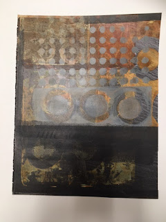
A few weeks ago, I dug out a gel printing plate and junk mail booklets that were printed on quality paper with a nice matte finish. I don't often use acrylic paint and only had a small range of colours to work with. This is how things started out:


The face print was a happy accident. I pulled a print and the photograph on the page transferred to the gel plate and I was able to pick up that image onto another page and then keep working around the image. Just a note -- the print is for my own enjoyment and experimentation. Likely the photo is a copyrighted image and therefore not legal to be used for art that will be sold. 

I kept working on full pages and got images like the one below (the paint obscures the original image yet the underlying colour, values and shapes add depth and mystery to the print):

Couldn't bring myself to chop this one up but most of the printed pages got cut down to 9x9-cm squares. Some I used to make a concertina book. 


Here is another concertina:


I also mounted the small square prints on 5x7-inch cards. I had seen an artist's work presented that way on Pinterest and liked how it looked. But somehow my prints seemed unanchored in a vast sea of white. 


Eventually I tried adding a coordinating strip underneath and suddenly the compositions started to work.


Some of the prints were overprinted with hand-carved stamps.


This is one of my favorites.


I like how the pattern in the strip echoes the main print and how that bit of dark shadow anchors the tree. Here are two more of the 5x7-inch cards:

Below is one that I liked but it seemed unfinished. Then I added the collaged bird. And that opened up a whole other avenue. Here it is matted:

The prints below could also benefit from an additional layer and a bit of collage might do the trick.

Now I'm happily heading down that rabbit hole and will report in soon with what happens next!

Thursday, March 10, 2022

What Have I Been Up To?

  (To read full post you may need to click blog title to view in your browser.)

It's been fairly productive in the studio the past few months. Here's a roundup of some of the projects.

Like many of us socially isolating during the pandemic, I amassed an embarrassing large stash of brown paper bags from too much take-out! Nothing to do but chop them up and stitch a lovely stash of blank booklets.


These booklets are fun to work into and, except for a little time, cost nothing so it's easy to experiment and, as interest wanes, simply start a new booklet.

One thing I did find, though, was that many of the bags seem to have been treated with a type of waterproofing, which created a resist with some art products. Below, you can see the effect of the resist. I quite enjoyed its splotchy and unpredictable nature.

I took a few free online workshops, including one offered by Winslow Art Center in Washington state with art teacher Amis Balcomb (she doesn't seem to have a website). 

 https://winslowartcenter.com/past-free-classes/amis-balcomb-the-embellished-simple-sketch/ 

I'd taken another of her classes and she is big on using water-soluble crayons and pens to elevate simple landscape sketches.


These chunky Lyra brand graphite crayons are great. As well, the ink in many office supply fineliner pens is water soluble. Who knew?

Here're a few with added colour -- ochre acrylic ink.


A stack of postcard blanks at the ready is handy for a bit of quick gel plate printing, like these moody landscapes:

I also got back into the habit of a daily (almost) sketch. The first one below is a tissue paper monotype collage with a bit of rubbing. I love adding text to a sketch.


The two below are examples of some larger sketches (11x15-inches) using an idea from  the YouTube channel Yeates Makes where you first create a random background and then sketch on top. Somehow that technique is very freeing!


I'd also been casting about for a textile craft I could do in the evening while watching TV. Wasn't keen on crocheting or knitting. Cross stitch was out. For a while, I hand-stitched small fabric collages (about 6x6-inches), like below.

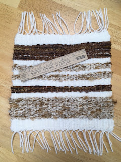
But they required a certain amount of pre-planning. I wondered if weaving might be the ticket... Got a stack of books (love, love public libraries), showed my ever-accommodating husband (who, from now on, shall affectionately be known as EAH!) a photo of a simple frame loom. Soon after he returned from his workshop with this beauty:

The book is Weaving by Mary Maddocks. Here's the first little sample (made with $4 worth of thrift store yarn).

Enjoying the meditative quality of over and under -- simple weaving is proving to be the perfect evening companion. Along with EAH!

I also got back into a good routine in the studio and have been warming up with some 9x9-cm prints, which I'll show you in the next post. Meanwhile, all best to everyone!


Thursday, October 14, 2021

Making Paper for Collage and a Fond Farewell

 (To read full post you may need to click blog title to view in your browser.)

My first exposure to making papers for collage was the whimsical art of the late, great Eric Carle, creator of the iconic children's picture book, The Hungry Caterpillar. If you watch any video on his art making, it's easy to see his joy in painting and texturing stacks of paper -- all fodder for his famous collage illustrations.

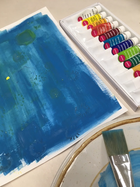
Another artist whose collage appears to be made entirely from her own hand-painted and printed papers is British crafter Clare Youngs. After watching a mark making tutorial on her web site, where she mentions using gouache, it reminded me I had a set  of gouache paints tucked away. Gouache is basically opaque watercolour and I think it's that opacity that gives Youngs' iconic work the bold vibrancy it's known for.

I followed Youngs' suggestion and used a stash of papers from the recycle bin -- flyers, old photocopies, envelopes, etc.


This paper was a clean-up sheet and I painted right over the daubs of tempera paint.

This was another clean-up sheet and while the paint was still wet I lifted some of the paint with a piece of plastic salvaged from a food container. Love the tiny grid!


This is just copy paper and after the first coat was dry I stamped over top. To me, that's when the papers start to get interesting.


This was paper from a financial report and I liked working over that grey stripe.


Corrigated card stamped over a painted sketchbook page.


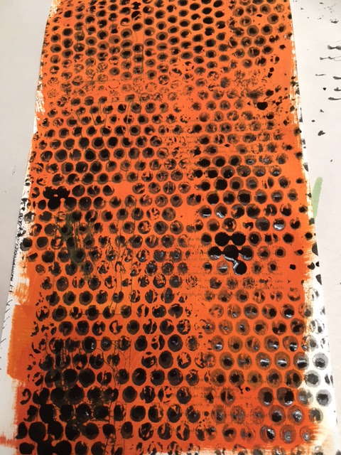
Good old reliable bubble wrap!


A few hours later I had a good start on a stack of papers. I'll likely do more stamping and over-printing. And it will be interesting to see how it is to collage with this paper -- the gouache gives in a matte finish and stiffens it.

Below, are collage papers made using printing inks. They're mostly Asian papers or art tissue and are softer and more flexible yet they also have a bit of a napped finish. 


Below I'm using tempera paint and building up layers.


Getting an interesting speckle with this jute-covered loofah.


Acrylic paint gives rich colour and a slight shine and slickness to the papers. A note here -- you can layer acrylic paint over printing ink but not the other way around. At least that's the case with Akua brand inks which dry by absorption. The acrylic paint seals the paper, preventing the ink from sinking into the paper.


Now have I ever mentioned I like grey?


There is a plan for these stacks of grey and other dark papers. Here's a peek:


During the pandemic lock-down I got in the habit of cutting down delivery boxes into 4x4-inch squares. The corrugated cardboard makes a sturdy substrate for these huts-and-sheds collages. 


Sometimes I change up the dark palette for a spark of bright colour.


It's hard to believe but it'll be a year tomorrow since I started the Red Gate Studio blog! It's been wonderful sharing my art adventures. It's bittersweet to say so long but now it's time for a break. 

Thank you, everyone, for following along with me this past year! I'll see you in the new year!