Thursday, May 26, 2022

Plum Puddin'!

  (To read full post you may need to click blog title to view in your browser.)

This is another studio afternoon warm-up exercise. Once again, I started with an old art magazine -- often the paper is of exceptional quality -- and the images are inspiring company!

I cut down the pages to my standard 9x9-cm squares.

For a while I worked with Akua Kolor, the liquid version of ink developed for monotype work (now that Speedball has acquired the company it's called Akua Liquid Pigment). Didn't get the best of coverage and, like the thicker Akua Intaglio ink, it was going to take ages to dry.

I switched to acrylic paint and picked plums as my subject. I love the look of plums (they come in such a gorgeous array of colours, all the way from pale green to midnight indigo) plus their size and shape suited my small squares. Truth be told, I picked plums because I have a bunch of plum back-of-notecard labels needing to be used up.

I rolled up a small Plexi-glass plate with white paint and then used a chopstick to draw a loose sketchy plum -- sometimes I wiped out some of the white ink with a cotton swab and/or a small piece of cloth -- and pulled prints with the magazine squares.

The blue you see above is the colour of the Plexi-glass plate. And here's a tip -- a silicone baking sheet holds the plate secure for inking up -- AND -- resists ink so if the brayer goes off the plate there is very little cleanup!


I loved how bits of the underlying image would show. With happy accidents sometimes a perfect chit of colour would be revealed in a leaf or the curve of the plum. However, at day's end, I felt too much of the original magazine image was revealed and that the art work featured was recognizable.

Still, I played around with the prints anchoring them with a strip of paper. The cheery commercial polka dot papers on these two post cards made me feel happy! Then I tried some with my own hand-printed paper and a tiny bit of collage.
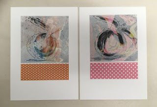

With one of the prints I was especially happy with how the image was obscured yet the revealed colours added so much to the print. Again, just the image popped onto a 5x7-inch card looked a bit lonely and unfinished.

I played around with different solutions and quite liked anchoring the print with a quick underlying roll of ink.


Apologies for the so-so quality of my photos -- overhead studio lighting is not the best. Hoping you can see the swatch of orange ink picked up the colour revealed in the leaf and carried it down through the composition.

The next time I was back in the studio I set about creating a background with similar colours to the magazine image. I printed this time with Akua Intaglio inks on some lightweight but robust calligraphy paper. Had to wait a few weeks for the squares to dry then had a go with the same plum monotype.


Sigh... A lot of work to get to this point and not achieve the images I'd imagined. But I'll keep tinkering -- thinking perhaps the backgrounds needed more variation. Or more wiping of the white ink. Not sure where this is leading but the journey, and pursuing an answer to the perennial question, "What if...", is exciting! See you soon.

Thursday, May 12, 2022

Needs Must

 (To read full post you may need to click blog title to view in your browser.)

Mid-spring we had a few nights away. It was off-season and the lakeside resort was a tranquil retreat. Great view, lots of walking and good food!

I'd taken along a sketchbook and the most basic kit.


A water brush, ballpoint gel pen in black, and two water soluble Derwent brand pencils. Inktense in Ink Black and a Graphitone grey in medium wash. That was it. But on one of our many walks I gathered some dried plants. (I should add the Ponderosa Pine was already on the roadway. I didn't tear it off the tree.)


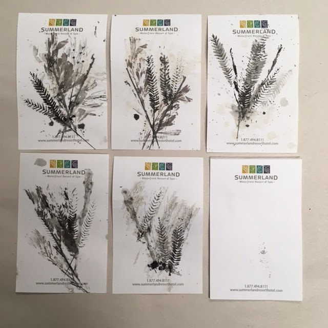
I felt drawn to try and print these. So needs must, as the old British saying goes. I had the two water soluble pencils and some leftover coffee! 


The only loose paper available was a tiny notepad. I took everything outside to the equally tiny balcony table. Submerging the plants in the coffee was a so-so success. Gave a bit of background colour but no definition. However, rubbing the grass heads with one of the pencils worked great!


Using the brush, I daubed the "inked" up seed head with a bit of water, pressed the ink-side down on the notepaper and covered with another piece of paper. Some judicious rubbing with a finger and there was a half-decent print. Alternating the grey and black pencils allowed for a bit of depth in the print.


When I got home, where I had more supplies, I used a grey stamp pad to ink up the leafy sage. 

I also dug out a chunky Lyra brand water-soluble graphite pencil. This worked great, offering up a rich, dark grey.


I don't know if you can tell by the photo below but rubbing the coloured pencils over the dried grasses really barked up the nibs. The Lyra graphite, on the other hand, is so robust and yields a ton of colour. The plan for further weekend jaunts is to toss a few of them in with my sketchbook. They come in varying degrees of intensity -- I've got a 2B, 6B and 9B, the one I used here.


A few twigs and leaves were the subject for a daily sketch and, again, I also used the graphite pencil  for  shading. The whitish areas in the photo below were done with natural clay picked up on one of our many holiday walks.


On a little aside, I do wonder if some other artist had also sat out on that tiny third-floor balcony, sketching or making something. Right at my chair, there lay a single stalk of dried grass. It was a bigger plume-y grass, not one of mine. And, unless a bird dropped it, the only way it got there was at the hand of a guest. So as a souvenir, I inked it up and printed it in my sketchbook.


Sitting on the balcony, working with these limited rudimentary supplies, was relaxing and satisfying. And who knows where it will lead. Might turn out to be simply a pleasant hour on holiday or I'll notice bits of graphite-printed plant material working it's way into some future project.

Thursday, April 28, 2022

Flickers and Sorting Paper

  (To read full post you may need to click the title to view in your browser.)

All winter we were visited by a shy and charming flicker. He didn't like me trying to get a close look and I'd only get a glimpse of his plumage. Greys and browns and then those startling flashes of red! Nothing to do but head for my bins of collage paper.

A few months back I had finally taken on the daunting task of corralling my tons of paper -- old prints, hand-stained tissue, clean-up sheets that were too enticing to toss, purchased Asian papers, brown wrapping and packaging, junk mail, envelopes -- into some kind of order. Up to then, I sorted everything (in an off-hand way) by material. Acrylic prints here, Akua prints there, a file for tissue, packaging in this tub, envelopes in this box. But there was simply too much and it took ages to find anything.

Rather than sort by material I came up with the idea of sorting by colour!


And that has worked amazingly well. I took three large bins that were already stuffed with paper and emptied them. Then I did a heartless weed. Stuff went into the recycle bin and out to the curb before I could change my mind. With what remained, I began to sort by colour -- warm, cool and neutral. Besides those three bins there is a bin for commercial stuff like coloured cardstock or origami paper and another bin for blank fine art paper. There are also three or four small tubs for paper bits too good to toss. But the bulk of the "system" is the three bins. Now when I come across something I want to save in it goes to the appropriate bin  and we're done. So far, it's working!

For the flickers I went through the neutral bin for browns and greys and had a quick dig through the warms for a bit of red.

With the help of some online photos and our trusty Roger Tory Peterson bird guide I roughed out a flicker shape and made this jaunty fellow:

This one I counted as my daily sketch. Then I made these:


I went back and forth between making the flicker realistic or more whimsical. Spoiler alert -- whimsy won! I'm not really a bird person and know nothing about their anatomy. Always surprised how far back the legs are attached on a bird's body. Usually my birds look like this:


But it was good practice for my eye and my brain to aim for correct proportion and to pick out one or two telling details that would make my interpretation of a flicker read as a flicker. I'll keep making more of these dapper birds as I come across paper printed with just the right graphic pattern. And, after watching a fascinating Nature of Things documentary, I'm stacking up potential collage papers for owls who, news to me, can have rich russet red feathers! (And those papers will be in the warm bin!)


Thursday, April 14, 2022

Trust the Process

 (To read full post you may need to click blog title to view in your browser.)

Last spring I signed up for British abstract artist Louise Fletcher's Find Your Joy. This free course is full of generous, practical advice for any artist in any medium. In essence, Louise advises us to do more of what we like -- that which brings us joy -- and less of what we don't like! Sounds simple, but it can be easy to get side-tracked and/or overwhelmed with all the fabulous art and options just a click away on social media. 

Pay attention to the colours that speak to you, she says. The shapes, the marks you make that interest you. What you're drawn to in art you like. This one can be tricky, though, because while you love what certain artists do, it doesn't necessarily mean you will love it in your own work. This happens to me. I marvel at artists who build up rich, dense, multiple layers in their work. But in my own work, I'm most happy with a quality of spareness.

But I want that spareness to have interest. And depth. And mystery.

I've always suspected that but it's taken me a full year of thinking and playing around to really know it.

Here's a small collage I made earlier this month:


I made several like this, following an on-line tutorial (sorry, I can't recall which one it was) but the more I worked on them, the worse they got. This one started out with the central strip with the text. By the time I called it quits, I'd obscured the only bit that spoke to me. By "the worse they got" I mean the less the image excited me and the less it resonated with me.

But by no means am I saying the process was a waste of time. I worked on composition and value, line and shape -- and all of that was of interest. And it reinforced my attraction to spareness. At least, my interpretation of spareness.

I think this is what Louise is getting at in Find Your Joy. Our best art reflects our preferences -- our unique take on the world. She says not everyone will like what we like, and that's okay. Because our best work -- the work that satisfies -- is the work that speaks to us.

A fun exercise has been to look over past work and note what I like.


This is the type of collage that most speaks to me. My challenge is to work in enough "texture" and detail to keep the image lively.


This forest is a really old print but I'm still happy with it. Again, there's a certain spareness.


Another oldie. But I like the simple, and loose, structure. Plus the high contrast.

This landscape could use a little something. Might be a bit too spare! But I find the image calming and relaxing.


I love this one! My first time experimenting with a high horizon.


Just fooling around here. I did a number of landscapes like this -- drawing over a random background. And I've come to realize "line" is important to me. Last year I went to a live model drawing class to keep a friend company -- the human figure doesn't call to me -- and yet I enjoyed the challenge of tackling a subject I wouldn't normally choose. And when the instructor said I had good line, I was thrilled!


This one (a monotype with hand-stained tissue collage) is one of my favourites. I think it's the subdued colours and the bit of white around the pot. Love the slightly off-register look. 

The Find Your Joy course came at just the right time. I was ready to narrow the focus of my work and to discover what it is I most want to make. Since taking the course, I'm more open to just following my instincts, to not having a plan or being overly swayed by all the gorgeous imagery I see on social media.

The free 8-day course is running again, starting May 20. On the last day, Louise does give a plug for her full paid course but it's low-key. I'm signing up again, and if it's something that appeals, here is link.

Here's to finding joy!

Thursday, March 24, 2022

Printing Small!

(To read full post you may need to click blog title to view in your browser.)

One of the joys of printing with Akua ink is their property of drying by absorption (rather than evaporation). This means as long as the ink is sitting on a non-porous surface (like glass, plexi-glass or even a plastic sheet) it remains open and will not dry. This gives you unlimited time to play around, daydream, experiment -- even walk away for an hour or a day.

Acrylic paint is the polar opposite. To someone used to working slowly and methodically, that stuff dries in a blink of an eye! But the push to work fast can be energizing. And because each layer dries quickly, you can produce a batch of finished prints in an afternoon. Sometimes, with the Akua inks, a week or two will pass before I can add the next layer.

A few weeks ago, I dug out a gel printing plate and junk mail booklets that were printed on quality paper with a nice matte finish. I don't often use acrylic paint and only had a small range of colours to work with. This is how things started out:


The face print was a happy accident. I pulled a print and the photograph on the page transferred to the gel plate and I was able to pick up that image onto another page and then keep working around the image. Just a note -- the print is for my own enjoyment and experimentation. Likely the photo is a copyrighted image and therefore not legal to be used for art that will be sold. 

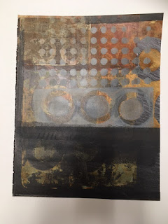
I kept working on full pages and got images like the one below (the paint obscures the original image yet the underlying colour, values and shapes add depth and mystery to the print):

Couldn't bring myself to chop this one up but most of the printed pages got cut down to 9x9-cm squares. Some I used to make a concertina book. 


Here is another concertina:


I also mounted the small square prints on 5x7-inch cards. I had seen an artist's work presented that way on Pinterest and liked how it looked. But somehow my prints seemed unanchored in a vast sea of white. 


Eventually I tried adding a coordinating strip underneath and suddenly the compositions started to work.


Some of the prints were overprinted with hand-carved stamps.


This is one of my favorites.


I like how the pattern in the strip echoes the main print and how that bit of dark shadow anchors the tree. Here are two more of the 5x7-inch cards:

Below is one that I liked but it seemed unfinished. Then I added the collaged bird. And that opened up a whole other avenue. Here it is matted:

The prints below could also benefit from an additional layer and a bit of collage might do the trick.

Now I'm happily heading down that rabbit hole and will report in soon with what happens next!